Monster Toys.
Monster Toys approached us with a brief to design engaging and creative packaging for their new oven-bake clay product. The packaging needed to not only highlight the sensory nature of the clay but also showcase the kind of creations children can make using it.
Target Audience:
The product is aimed at children aged 8 and above, of all genders and socioeconomic backgrounds, with a particular interest in arts, crafts, and hands-on activities.
To differentiate Monster Toys from key competitors such as Play-Doh, Bake Shop, Sculpey Oven-Bake Clay, and Fimo Kids, we conducted market research and proposed a unique selling point: turning the product into a collectible item. This approach adds an element of exclusivity and encourages repeat purchases. Additionally, we incorporated tactile sensory features into the packaging to enhance user interaction and spark curiosity—key factors in engaging our young target audience.


Theme
I developed a series of collectible monster characters to encourage repeat purchases, giving parents an added incentive to continue buying Monster Toys’ oven-bake clay.
To make the concept more engaging, I chose a “Galaxy and Planets” theme—an area of fascination that many children, regardless of gender, explore and enjoy at some point. This theme offers a rich visual palette, allowing us to incorporate a wide variety of colors, textures, and imaginative designs while maintaining a gender-neutral appeal.
Monster
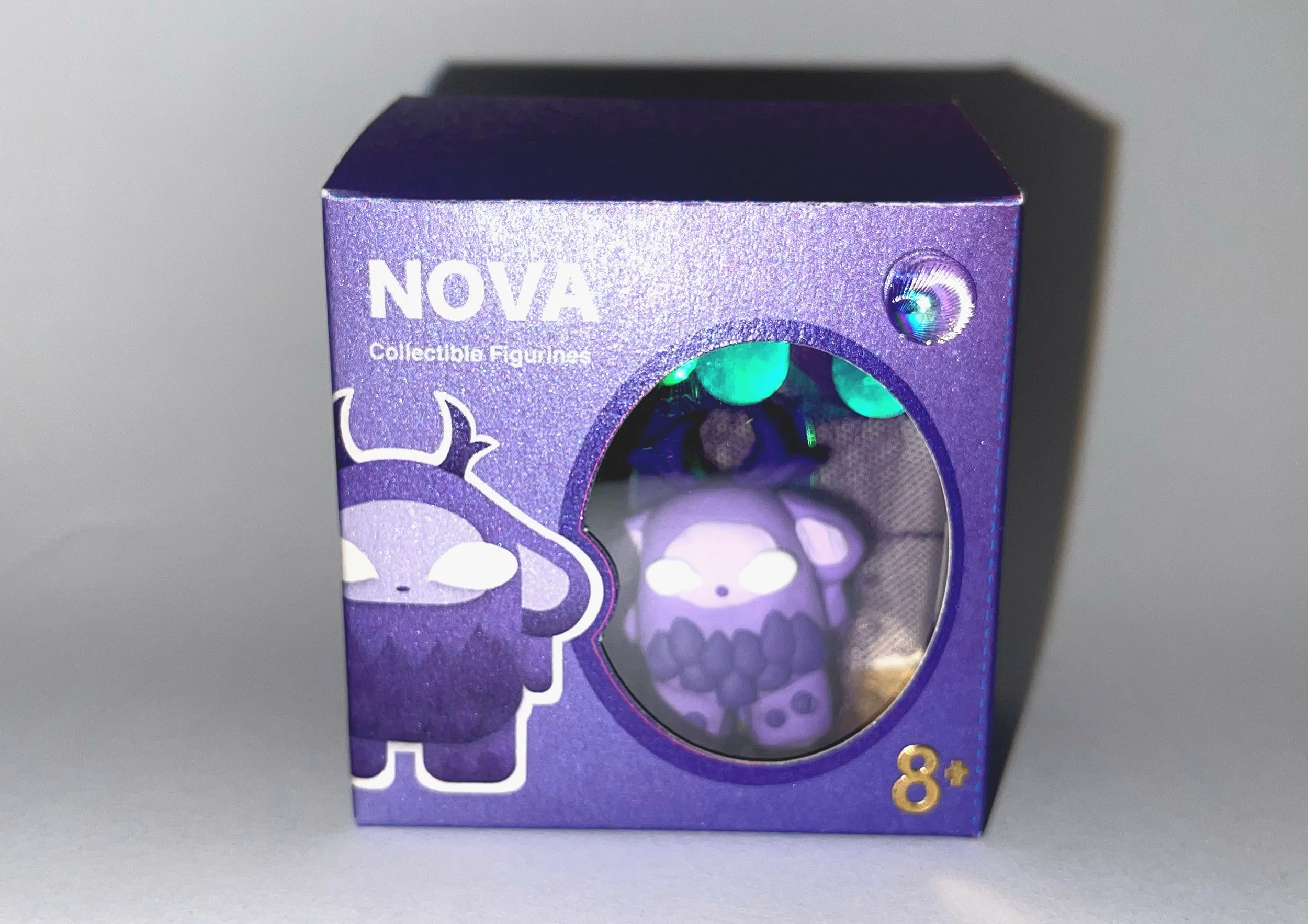
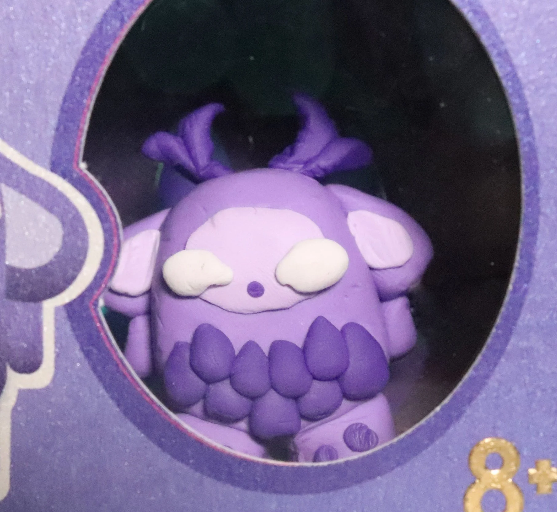
The first character I chose to develop was “NOVA”, a purple monster. I selected this character because purple is a gender-neutral color, making it appealing to a broad range of children. Additionally, creating the purple shade requires users to mix two clay colors, adding a fun and creative challenge that enhances the interactive experience.
NOVA features large, expressive eyes—an element commonly used in children’s animation to evoke friendliness and approachability. To make the character feel more dynamic and engaging, I included textured scale details that bring it to life. The overall shape of the monster is intentionally simple and easy to replicate, encouraging children to feel confident in crafting their own versions.

Packaging
For the packaging design, I drew inspiration from the monster characters by incorporating their scale textures into the interior. These scales were designed to be smooth and holographic, creating a shiny, tactile surface that invites interaction—an appealing feature for our target audience.
To enhance this sensory experience, I added a reflective gold element at the base of the packaging. This acts like a mirror, catching and reflecting the holographic scales, adding a magical, immersive feel to the unboxing experience.
To visually connect the interior with the exterior, I included gold stickers on the outer packaging, creating a cohesive and premium look.
Initially, I tested the design on plain paper, but after discovering silver paper as an option, I switched to it. The silver base complemented the "Galaxy and Planets" theme far more effectively, adding to the otherworldly, cosmic aesthetic.
The overall structure of the box was intentionally kept minimal and clean, ensuring that the focus remains on the monster figure and the sensory elements—key attractions for our young audience.